

Module output and interpretation
The classification module produces four types of plots:- Feature importance barplot: which microbial features the model relied on most to make its predictions.
- Confusion Matrix: for each real group, how often the model predicted the right group and which wrong groups it confused it with.
- ROC curve: how well the model separates one group from another across all decision cut-offs.
- Precision-Recall Curve: how well the model identifies the group of interest, the more informative view when that group is rare.
Feature importance
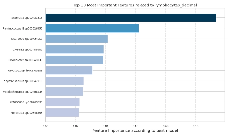
Top microbial features ranked by their contribution to the best-performing model's predictions. Longer bars mean higher relative importance within this run. Importance is for ranking, not effect size, direction, or causality.
Why is this plot useful?
- Identifies the features driving predictions: ranks taxa or functions by their contribution, reducing thousands of features to the few most relevant to the target, for validation or follow-up.
- Supports interpretability: explains the basis of the model’s predictions, not just its accuracy.
- Highlights candidate features for hypotheses: flags the features most associated with the target as starting points for investigation.
Confusion Matrix
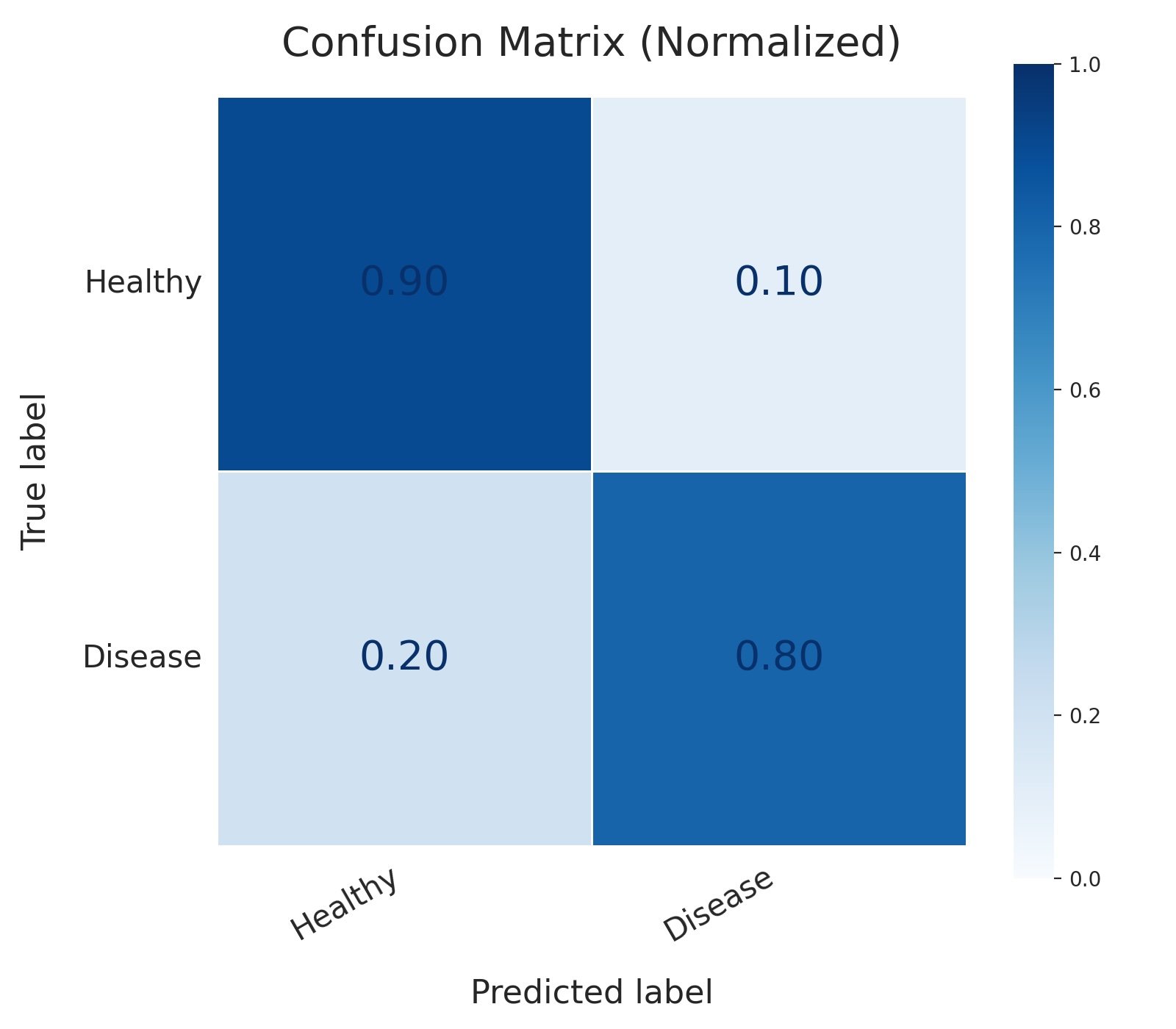
Confusion matrix for a binary classifier predicting healthy vs. disease status, with values normalized by true class. The model correctly identifies 90% of healthy cases and 80% of disease cases (true positive rate/recall). It misclassifies 10% of healthy patients as diseased (false positives) and, more critically, misses 20% of actual disease cases (false negatives), the error with the highest clinical cost in this setting.
- True negative (top-left, 0.90): a healthy sample correctly predicted as healthy.
- False positive (top-right, 0.10): a healthy sample incorrectly predicted as diseased, a false alarm.
- False negative (bottom-left, 0.20): a diseased sample incorrectly predicted as healthy, a missed case.
- True positive (bottom-right, 0.80): a diseased sample correctly predicted as diseased.
normalize="true"), so each cell is calculated as:Each row therefore sums to 1. For example, a value of 0.20 means that 20% of the samples belonging to that row’s true class were assigned to the corresponding predicted class.- Exposes per-class performance: shows whether the model handles both classes well or leans toward one, which a single accuracy score cannot reveal.
- Separates the two error types: distinguishes false positives from false negatives, so you can weigh them against the real-world cost of each in your study.
- Grounds the other metrics: the ROC and precision-recall curves below are derived from these same outcomes, so the matrix is the plain-numbers view that makes them easier to interpret.
Receiver Operating Characteristic (ROC) Curve
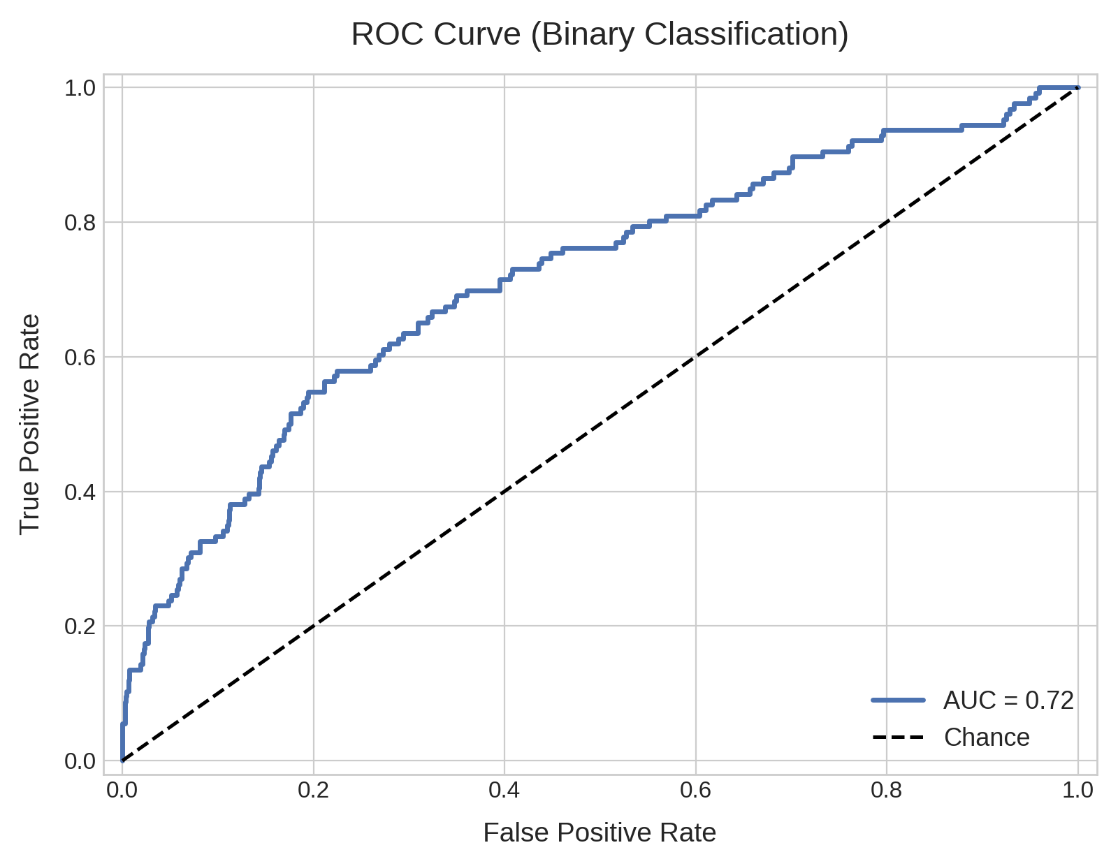
ROC curve for a binary classifier on an imbalanced dataset (10% positive class), plotting true positive rate against false positive rate across thresholds. AUC is 0.72, well above the 0.50 chance line. Despite this solid-looking AUC, precision remains low in practice (see the companion PR curve), since ROC can overstate performance when positives are rare.
What does the ROC curve represent about the ML classifier?
A ROC curve measures how well a classifier separates two (for example healthy vs disease, male vs female) or more classes (for example different disease stages, body sites, ethnicity) of your Target Variable. When a classifier predicts the target, it does not return a fixed label. It assigns each sample a probability of belonging to the positive class (for example, 0.80 for disease and 0.20 for healthy), and a threshold converts that probability into a label: above the threshold the sample is called positive, below it negative. Where the threshold is set changes the prediction, and it trades off two kinds of error:- A low threshold labels more samples positive. It catches more true positives (real disease cases correctly flagged) but also produces more false positives (healthy samples wrongly flagged).
- A high threshold does the opposite: fewer false positives, but some real cases are missed.
Area under the curve (AUC)
The area under the curve (AUC) is a single value that summarizes the whole ROC curve, between 0 and 1. It can be read as the probability that the model assigns a higher positive-class score to a randomly chosen positive sample than to a randomly chosen negative one. An AUC of 0.85, for example, means that in about 85% of positive-negative sample pairs the positive sample is ranked higher. The shape of the curve reflects the same thing:- Good classifier: the ROC bends sharply toward the top-left corner, reaching a high true positive rate while the false positive rate is still low. Its AUC approaches
1.0. - Bad classifier: when the ROC curve is close to the diagonal, the AUC approaches
0.50. As the threshold moves, the two rates rise together and the model separates the classes no better than chance.
Why is this plot useful?
- It evaluates the classifier across every threshold at once, which measures how well the model ranks samples without committing to a specific cut-off.
- It provides a single comparable number, the AUC, for ranking different models trained on the same data.
- It shows the trade-off directly, making it possible to read the false positive rate incurred to reach a given recall.
Precision-Recall (PR) Curve
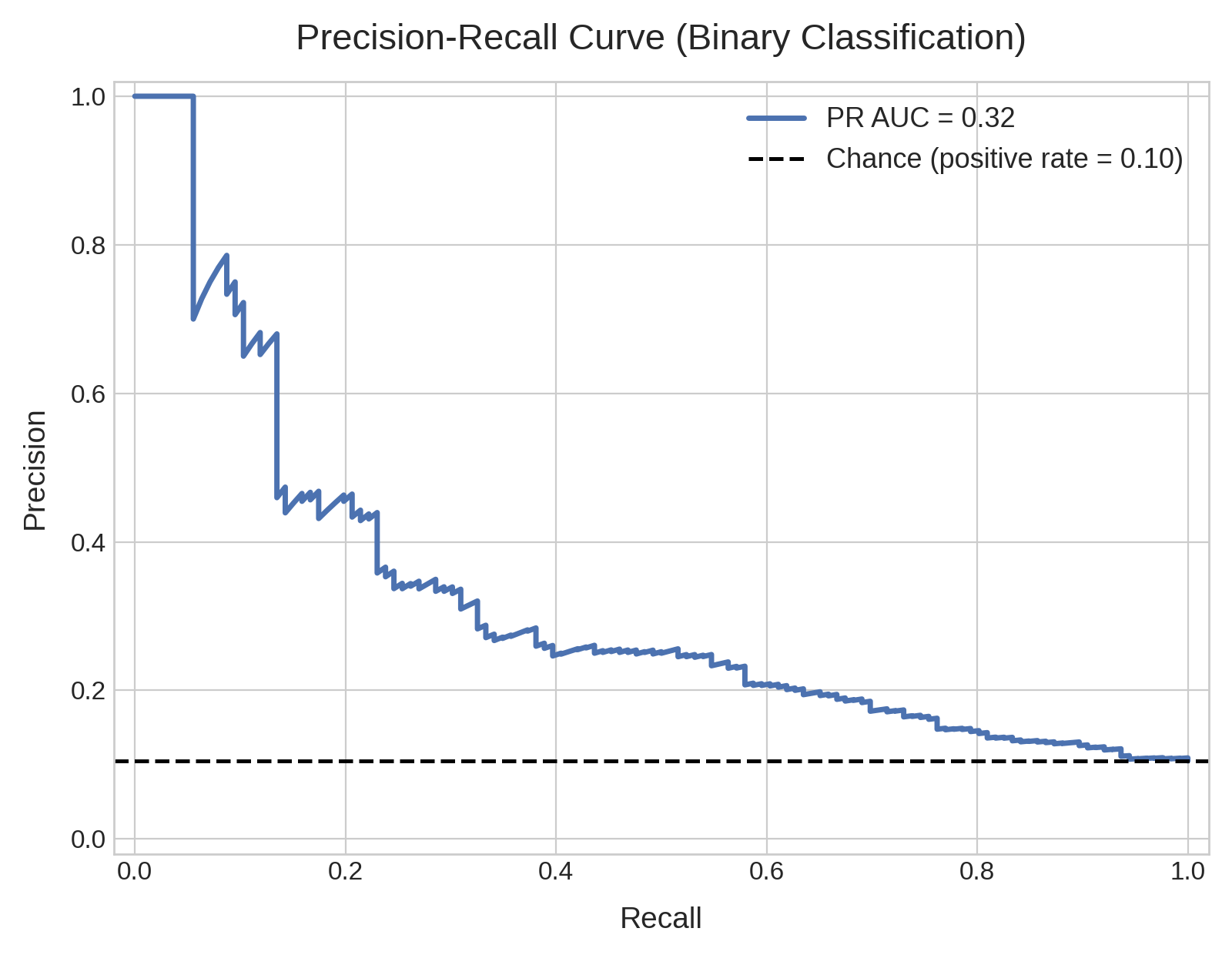
Precision-recall curve for the same classifier and imbalanced dataset (10% positive class) as the ROC curve above, plotting precision against recall across thresholds. The dashed line marks the 0.10 baseline set by the positive class prevalence, the precision a no-skill model would reach. Read the PR AUC against this baseline, not against 0.50.
What does the PR curve represent about the ML classifier?
Like the ROC curve, the PR curve summarizes performance across all probability thresholds. Instead of the true and false positive rates, the axes represent Precision (y-axis) and Recall (x-axis), two measures that emphasize the model predictive performances on the positive class:Precision
Recall
PR AUC (Average Precision)
Similarly to the AUC, also the PR curve is summarized as a single number between 0 and 1: the area under the curve, or PR AUC. On Cosmos-Hub 2.0 this is computed as the Average Precision (AP), the mean precision across thresholds weighted by the gain in recall at each step, rather than by geometric integration of the curve. The shape of the curve reflects the same thing:- A good classifier keeps precision high as recall increases, so the curve stays near the top and bends toward the top-right corner. Its PR AUC approaches
1.0. - A poor classifier loses precision quickly as recall rises, so the curve drops toward the baseline. Its PR AUC approaches the baseline value.
Why is this plot useful?
- It focuses on the positive class, so it reflects performance where positives are rare and the ROC curve can look overly optimistic.
- It shows the precision you can expect at a given recall, which maps directly to a decision: how many flagged positives are real if you want to catch a given fraction of the cases.
- It provides a single comparable number, the PR AUC, for ranking models trained on the same data, read relative to the class prevalence.