

Module output and interpretation
The regression module produces five plots, four that measure how well the model predicts and one that reports which features it used.- Feature importance barplot: which microbial features the model relied on most to make its predictions.
- Prediction plot: how close the predicted values are to the true values overall.
- Residual plot: where the model’s errors fall, and whether they depend on the predicted value.
- Relative error plot: whether errors are proportionally larger at low or high true values.
- Q-Q plot of residuals: whether the errors follow the expected pattern, or whether some samples are predicted far worse than others.
Feature importance
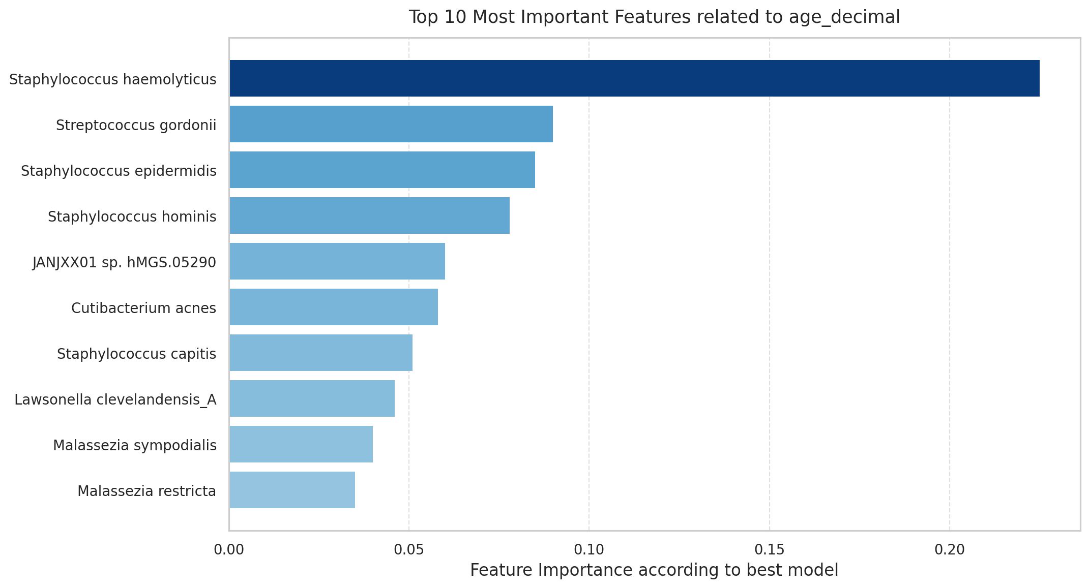
Top microbial features ranked by their contribution to the best-performing model's predictions. Longer bars mean higher relative importance within this run. Importance is for ranking, not effect size, direction, or causality.
Why is this plot useful?
- Identifies the features driving predictions: ranks taxa or functions by their contribution, reducing thousands of features to the few most relevant to the target, for validation or follow-up.
- Supports interpretability: explains the basis of the model’s predictions, not just its accuracy.
- Highlights candidate features for hypotheses: flags the features most associated with the target as starting points for investigation.
Prediction plot
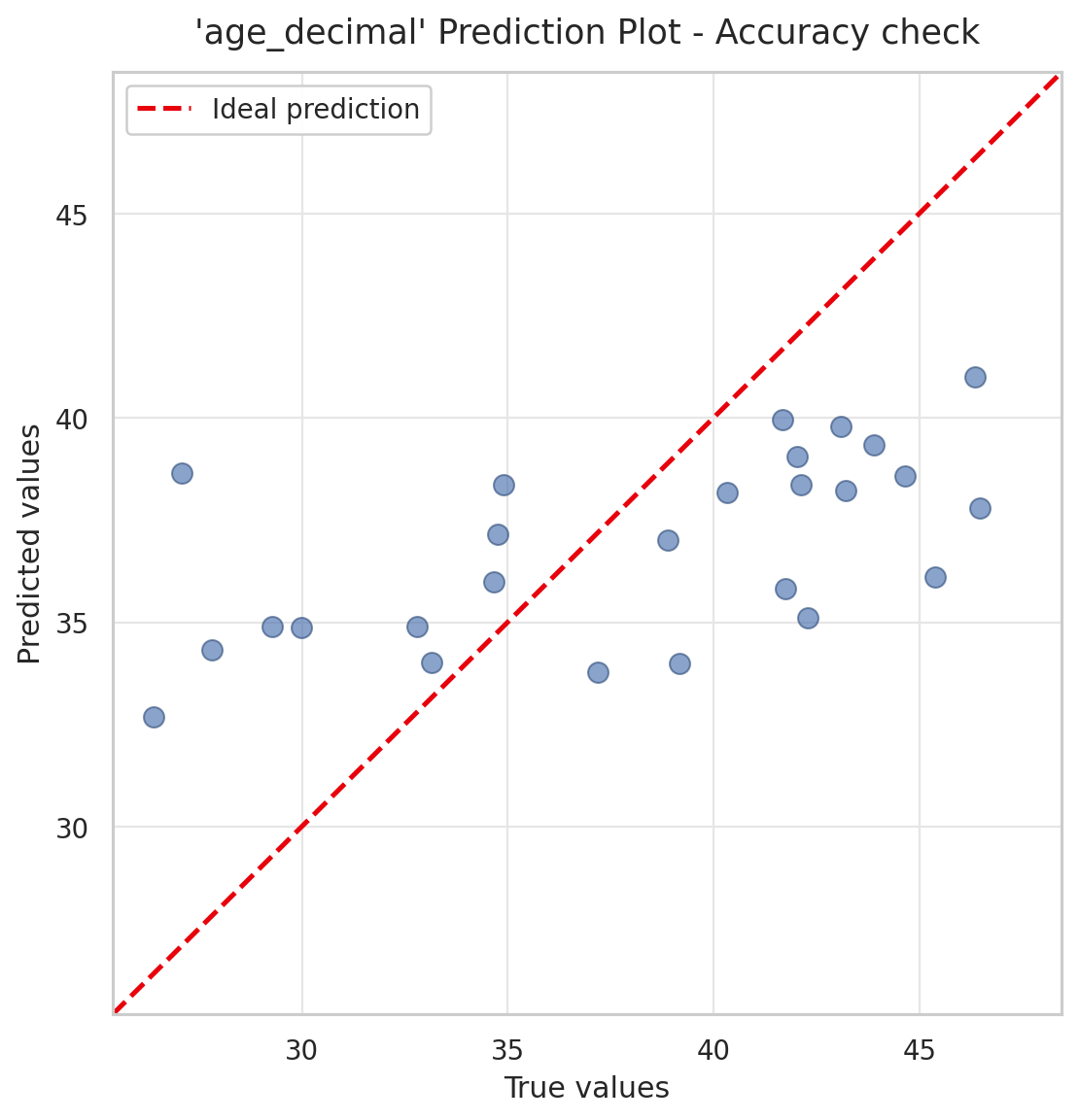
Prediction plot for a model predicting age (age_decimal). Each point is a sample, with the true value on the x-axis and the model's predicted value on the y-axis; the dashed red line marks perfect prediction. In this example the points form a shallower slope than the line: low ages are over-predicted and high ages under-predicted, so the model pulls its predictions toward the middle of the range.
- Points on the line were predicted exactly.
- Points above the line were over-predicted; points below were under-predicted.
Why is this plot useful?
- Gives an immediate sense of accuracy: shows how far, and in which direction, predictions fall from the truth.
- Reveals systematic bias: for example predictions pulled toward the mean, or a consistent over- or under-prediction.
- Shows where the model works: the range of the target it predicts well versus poorly.
Residual plot
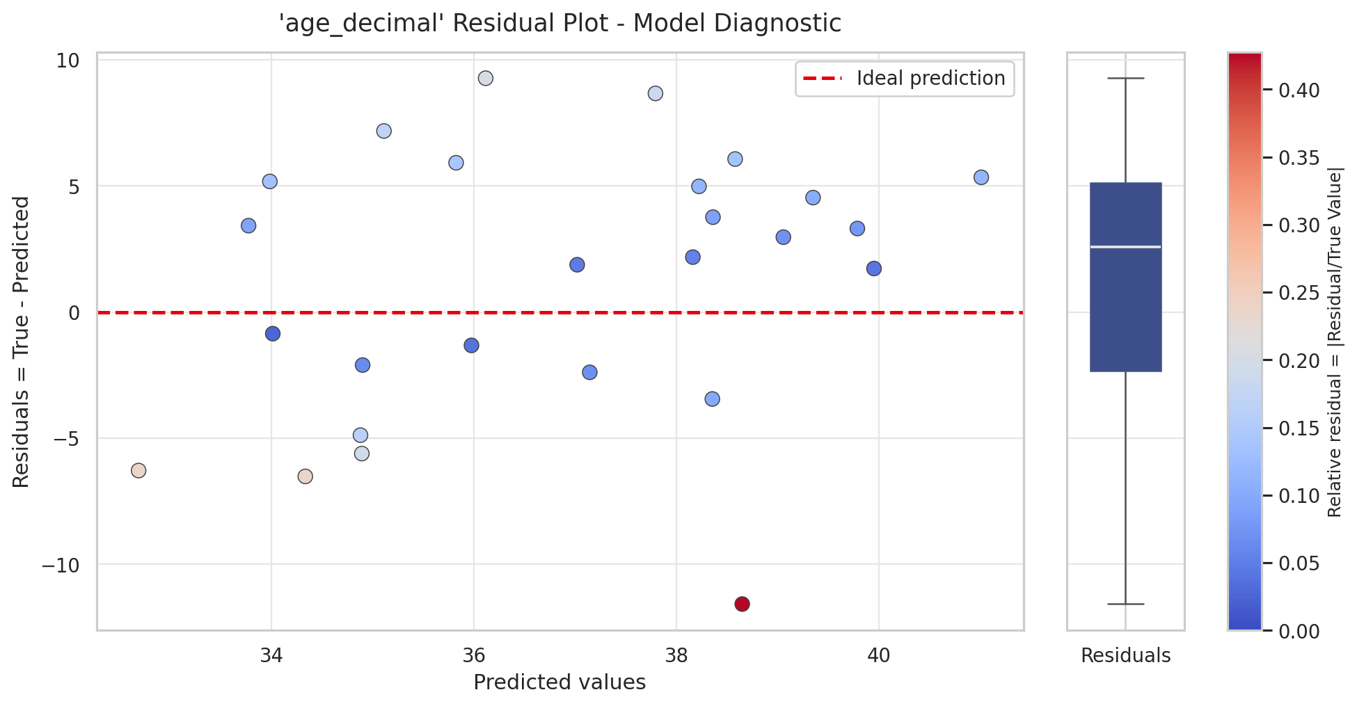
Residual plot for the age model. Each point is a sample: the x-axis is the predicted value and the y-axis the residual (true minus predicted), with the dashed line at zero marking perfect prediction. Point colour shows the relative residual (the error as a fraction of the true value), and the boxplot on the right summarizes the spread of residuals.
- Points above the line have a positive residual: the model under-predicted them.
- Points below the line have a negative residual: the model over-predicted them.
Why is this plot useful?
- Shows whether errors are unbiased: if the points scatter evenly around zero, the model is not systematically over- or under-predicting.
- Reveals range-dependent accuracy: a trend across the x-axis means the model is more accurate for some predicted values than others.
- Flags individual samples: points far from the line, or coloured for a high relative residual, are candidates to inspect separately.
Relative error plot
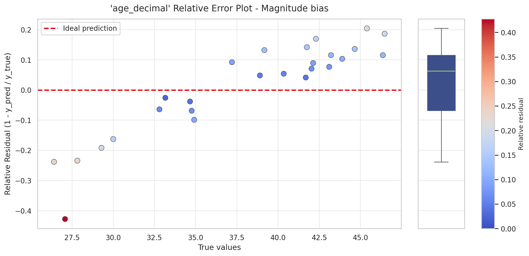
Relative error plot for the age model. The x-axis is the true value and the y-axis the relative residual, so each error is expressed as a fraction of the true value. In this example, low ages carry large negative relative residuals (strong over-prediction) and high ages positive ones (under-prediction), the magnitude bias expected when a model pulls predictions toward the mean.
1 − predicted / true, which equals the residual divided by the true value.
This matters because a fixed error means different things at different scales: being off by 2 years is minor at age 45 but large at age 5. The relative error plot makes this scale-dependence explicit.
- A positive relative residual means the sample was under-predicted; a negative one means it was over-predicted.
- A trend across the x-axis reveals magnitude bias. In the example, low true values carry large negative relative residuals (over-prediction) and high true values positive ones (under-prediction), so the largest relative errors sit at the low end of the range.
Why is this plot useful?
- Puts errors on a comparable scale: a 2-unit error is judged relative to the true value, not in absolute terms.
- Exposes bias at the extremes: shows whether the model is proportionally worse for small or large targets.
- Complements the residual plot: the residual plot shows absolute error, this one shows error relative to size.
Q-Q plot of residuals
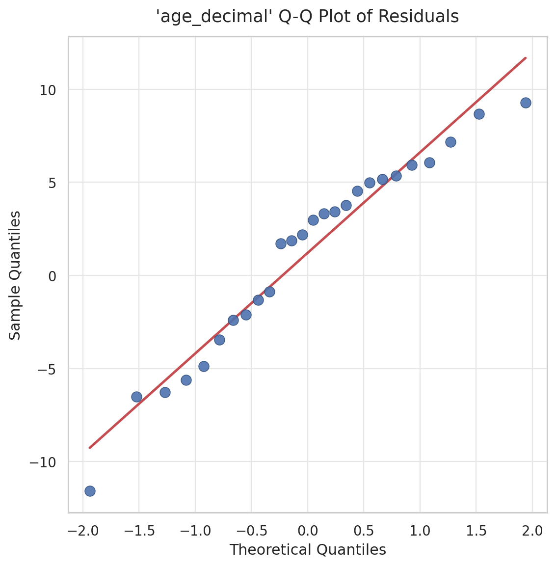
Q-Q plot of the residuals for the age model. Sample residual quantiles (y-axis) are plotted against the quantiles expected from a normal distribution (x-axis), with the red reference line for perfectly normal residuals. The points track the line closely, indicating the residuals are approximately normal.
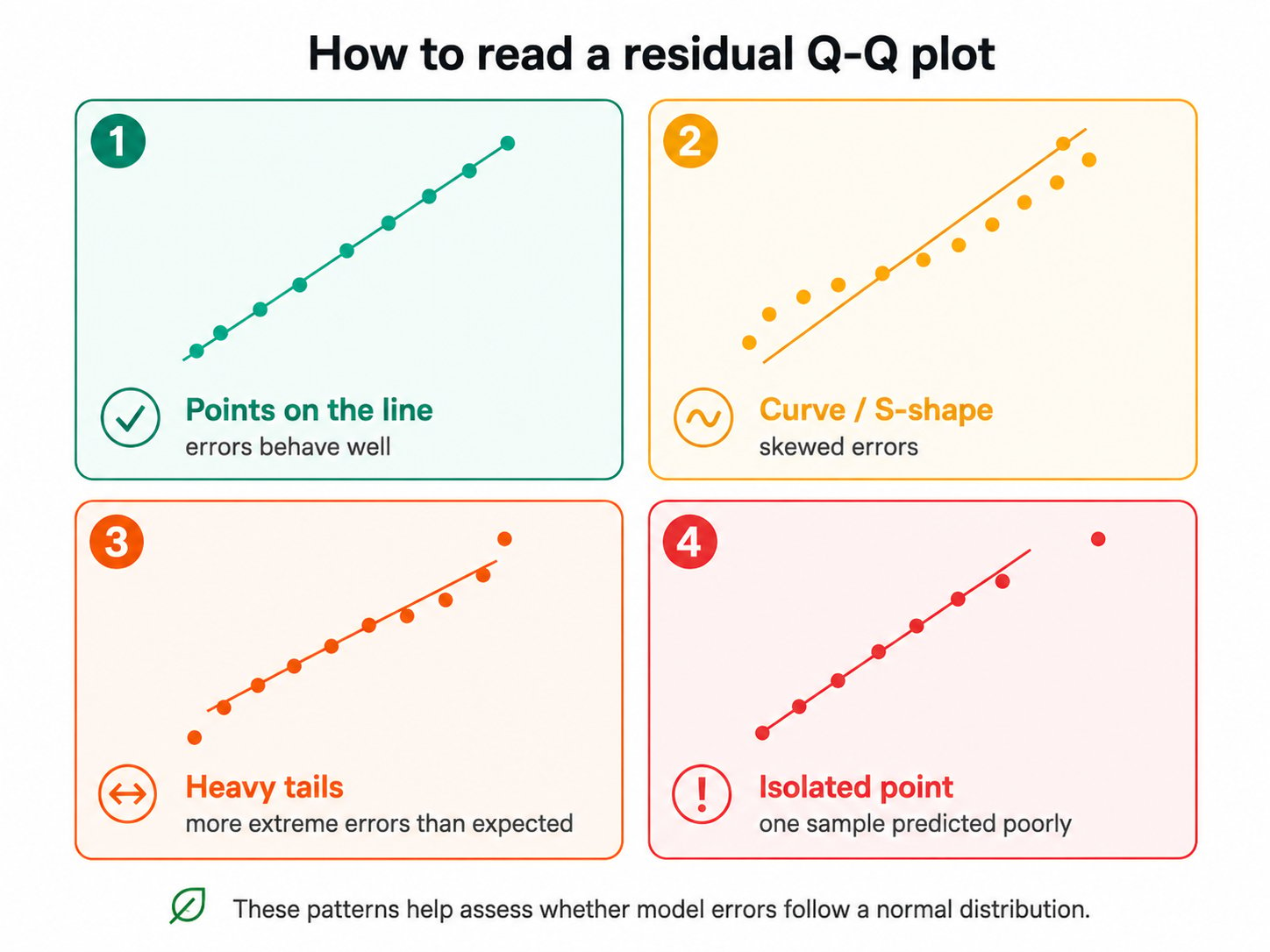
The four patterns a residual Q-Q plot can show.